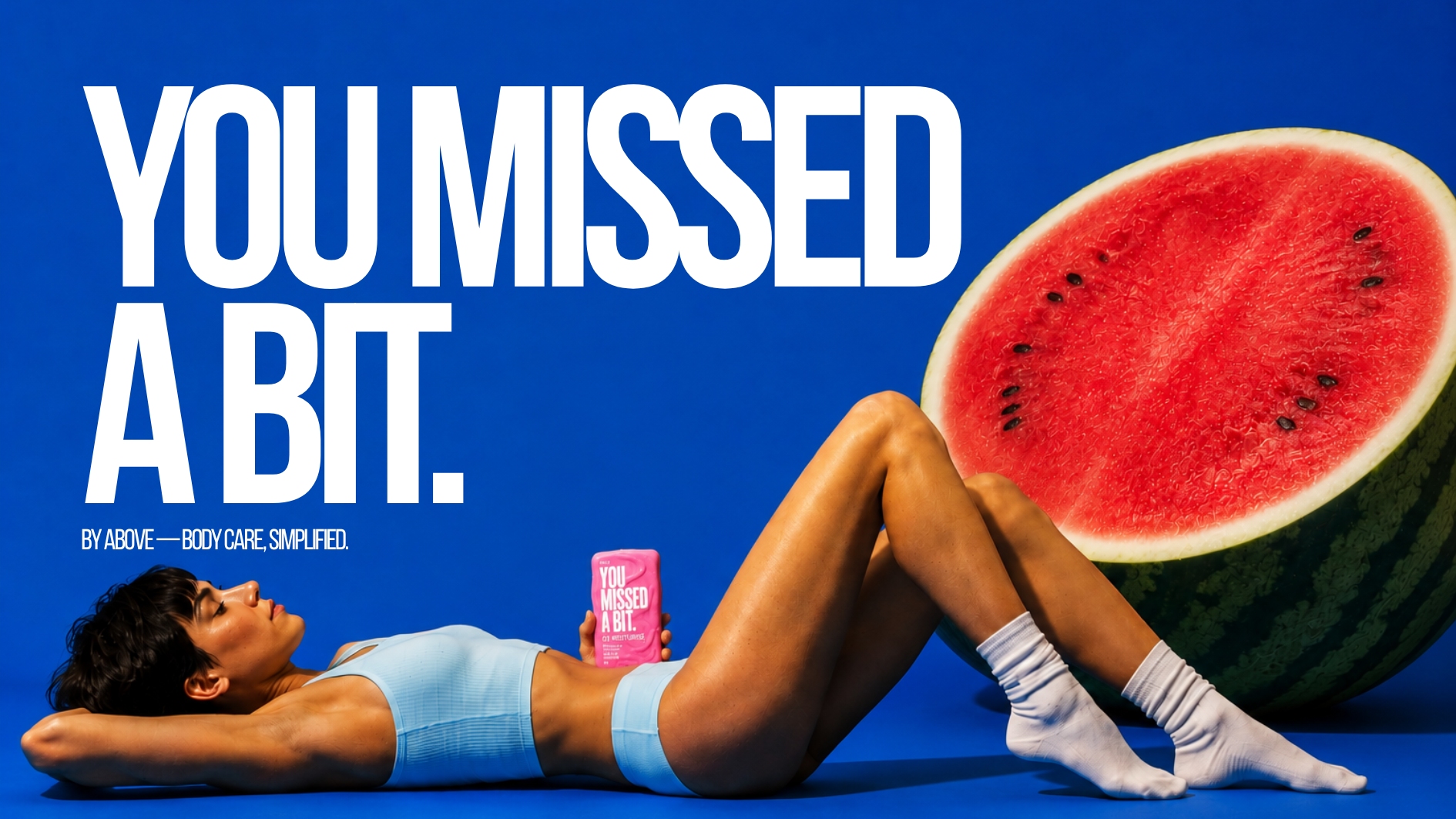
BODY CARE.
WITHOUT THE
HOMEWORK.
Starting with an open brief to launch a new product range for 18–30-year-olds, I developed a campaign around a simple tension: skincare has become complicated, but body care doesn't need to be.
Launch a new product range aimed at 18–30-year-olds in an increasingly crowded market, creating a campaign with a clear reason to be noticed, remembered and explored.
Skincare has become complicated. Multi-step routines, constant launches and conflicting advice mean body care is often forgotten altogether.
People don't need another routine. They need body care to fit into the one they already have.
THEY NEED BODY CARE TO FIT INTO
THE ONE THEY ALREADY HAVE.
YOU MISSED
A BIT.
YOU MISSED A BIT. became both the range name and the campaign platform. Rather than introducing another complicated routine, the idea points out something much simpler: we spend so much time thinking about the skin on our face that it's easy to forget about the rest of it.
YOUR FACE ISN'T YOUR
ONLY SKIN.
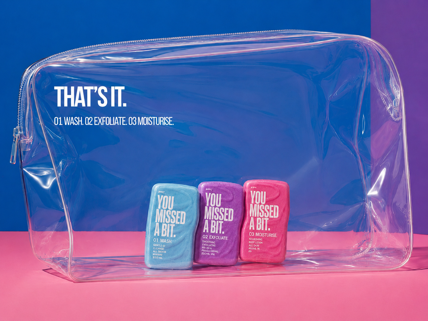
SIMPLE BY
DESIGN.
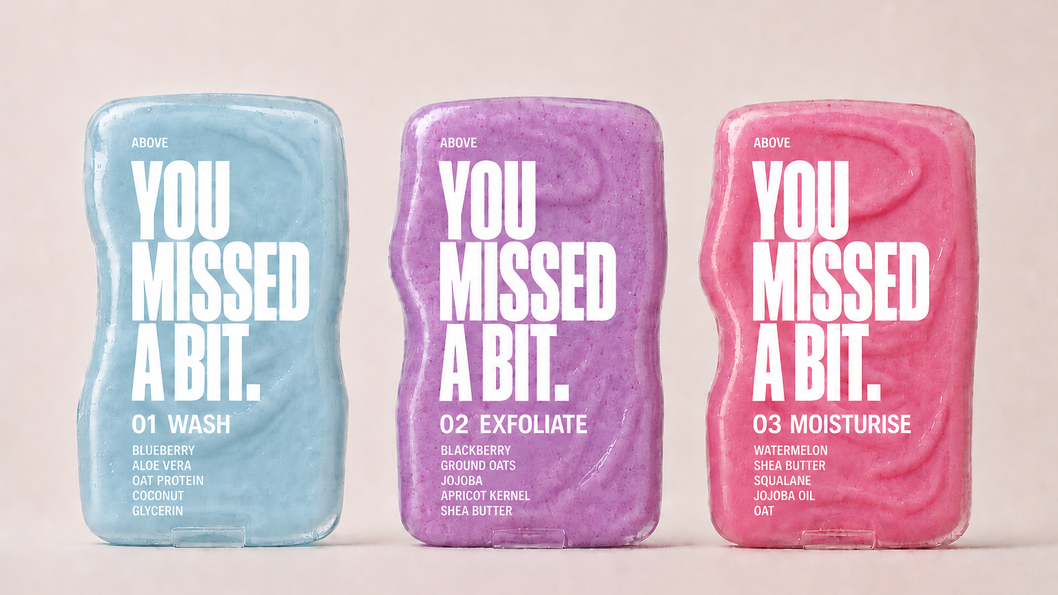
WASH
Clean.
EXFOLIATE
Smooth.
MOISTURISE
Hydrate.
NO CONFUSING LAYERING ORDER.
NO WONDERING WHICH BOTTLE COMES NEXT.
The simplicity became part of the packaging itself. A numbered system makes the order instantly understandable, while oversized typography turns the campaign idea into the identity of the range.
LOUD CAMPAIGN.
SIMPLE ROUTINE.
The visual identity mirrors the campaign idea: loud in expression, simple in structure. Saturated colour and oversized typography create impact, while a clear numbered system keeps the routine instantly understandable.
The wider palette gives the campaign room to move beyond the three products while keeping every touchpoint visually connected.
LOUD ENOUGH TO
GET NOTICED.
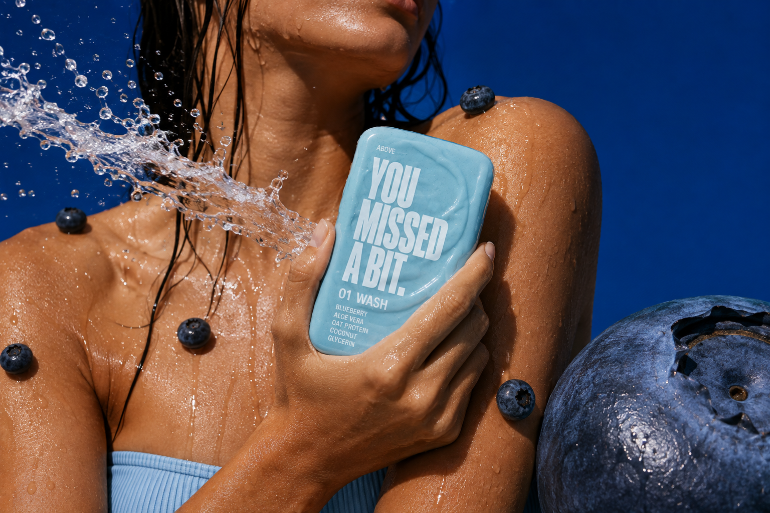
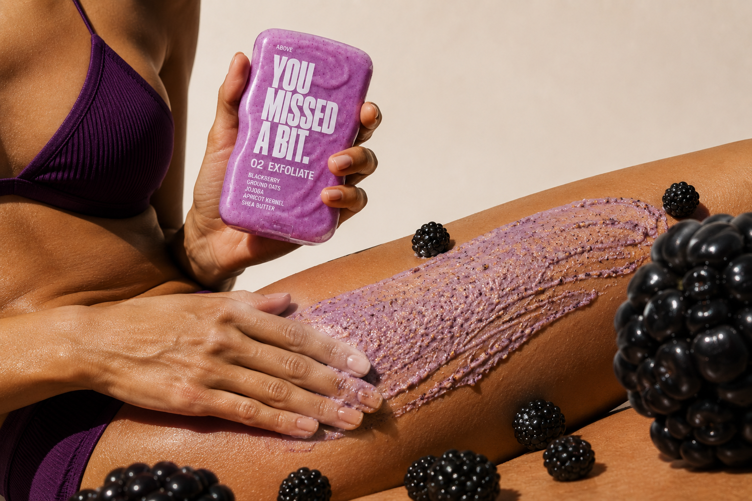
The campaign turns a deliberately simple routine into a loud visual world. Saturated colour, exaggerated ingredients, close crops of skin and direct copy make body care difficult to ignore.
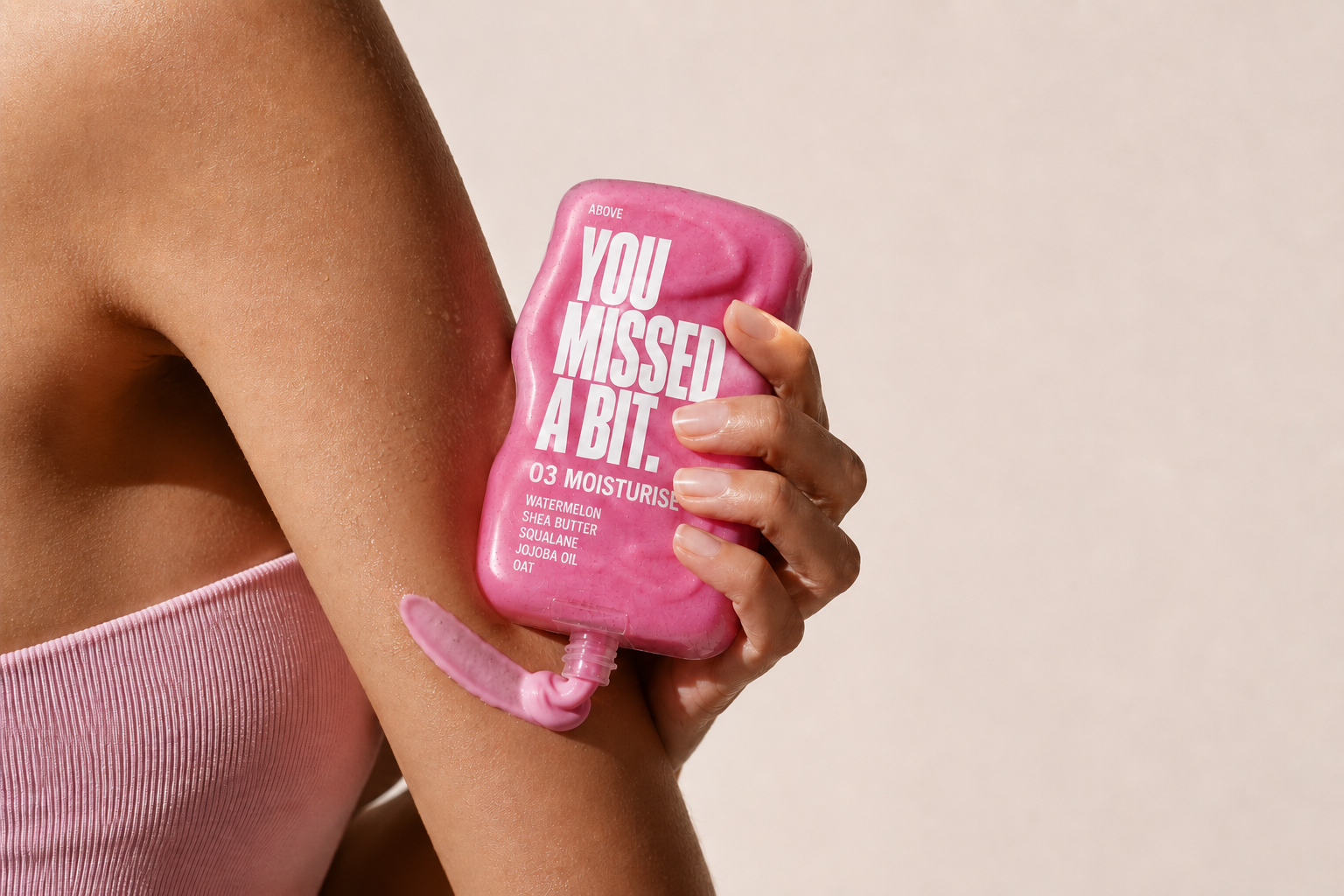
YOUR FACE ISN’T
YOUR ONLY SKIN.
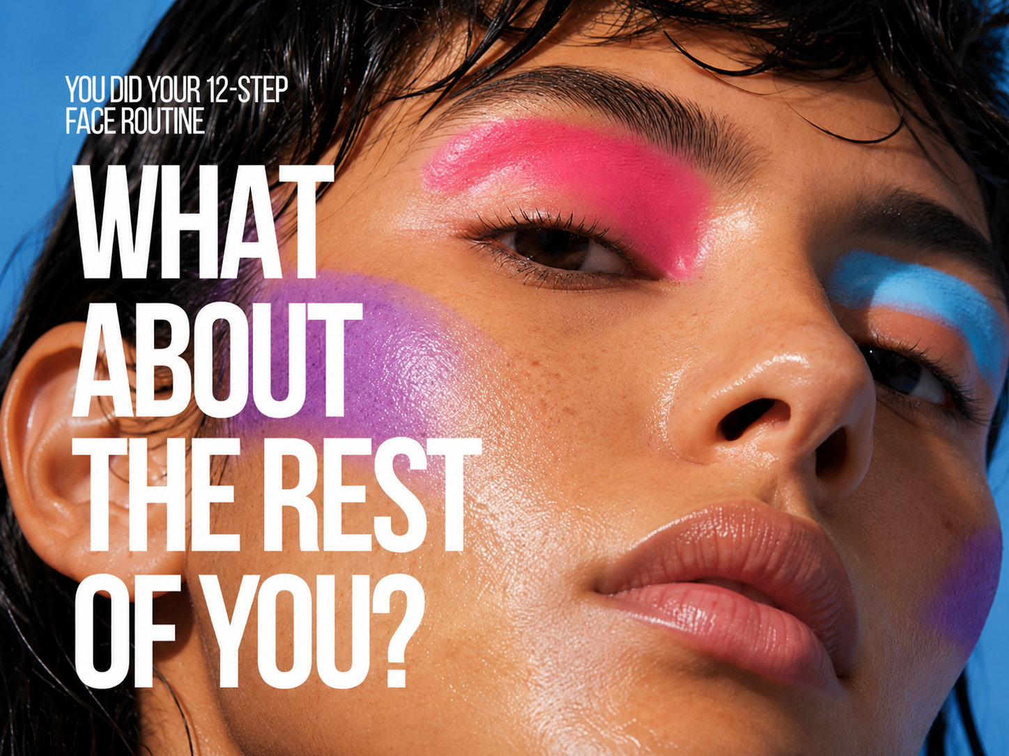
BUILT TO
MOVE.
AWARENESS
Bold creative designed to interrupt.
DISCOVERY
A simple three-step system that's easy to understand.
PURCHASE
Clear product roles make choosing straightforward.
BODY CARE WITHOUT THE HOMEWORK.
PROJECT
Self-initiated concept Body care launch 18–30 audience YOU MISSED A BIT. by ABOVE
MY ROLE
Campaign strategy Creative direction Brand identity Packaging concept AI image direction & prompt engineering Campaign design
OUTPUT
Packaging Campaign photography Paid social Digital creative Out-of-home